Market Structure

Looking through the Index moves | Analyzing Weightage based Segments

One of the perennial questions that’s in my mind as an Index trader is “What caused that move?” - We at NiftyScalper have been down several rabbit holes to find the answer, hopefully there is some light at the end of this “Market Internals” tunnel.

One of the things we are experimenting at the moment is looking at the index in segments.

Below are the three segments that you can see.

Segment 1 - HeavyWeights - In Red - 60% Weightage

Segment 2 - Mids - In Yellow - 22 % Weightage

Segment 3 - Bottoms - In Blue - 18% Weightage

Creating these segments helps us see the Index in a different light. One of the initial beliefs which we had about constituent stocks is that the bottoms which constitute 18% of weightage may not have much predictive value for the index, but we are learning something new about that belief, which I would share further down in this post.

Lets go back to the initial question that we started with “What caused this move?” - When I ask that question do note that I am usually looking at those Short time frame swings or trends which last anywhere between 45 mins to an hour.

To answer that question we look at the Average % Change of Prices of Constituents stocks in the above three segments of the Index. Do note, the Red line is the HeavyWeights, Yellow the Mids and Blue the Bottoms.

Image 1

To make it distinct visually I have drawn these boxes. Look at the first box in Image 1. That upward spike and the up move thereafter, it was the heavyweights which caused it, also notice the other two segments in the same time window, they are clearly diverging.

If you ask “Who caused that Up move?” - The answer clearly is the “HeavyWeights”. And if you ask who caused that down move - The answer clearly is the - “Mids” and the “Bottoms”. You will notice almost all through the day that was the pattern, the Heavyweights were trying to puss the index up and the Mids and Bottoms were pulling it down. Now lets look at another day.

Image 2

This is a sort of range bound day with a mild downward bias, as you can see the HeavyWeights were flat and a bit positive too holding up above the Zero line, where as it was the Minds and the Bottoms who were pulling in the index down.

What I have learnt so far about Index moves is this

1) Constituent Stocks oscillate between the two states of “Convergence” and “Divergence”.

2) The state of “Divergence” can also cause a directional move depending on the strength of the segments and the degree of the move in terms of Price change.

3) We get to see more stronger moves when there is “Convergence”. For instance we may have had an upward trend in the Index in the Morning session, by mid day you may see a Divergence in the segments, for instance say - the Minds and the bottoms are pulling the index down - now there are two possibilities either they (Minds and the Bottoms) converge with the Heavyweights and move up or the Heavyweights converge with the Mids and the Bottoms and move down.

These are pretty much the things which happen in the Index all through the day.

Now the question would be - How does this help in Trading?

1) Looking for developing divergences helps in identifying the beginning or an end of a move. Divergences can start with the Bottoms as well, and in some times the other two segments can catch up.

2) Knowing which segment is in control also helps in making an assessment of the possible degree of the move.

3) Past patterns can be used to predict the future. Machine learning and data science can be of use here.

Hope you found this useful!.

Pullback vs. Reversal | Can Market Internals Help?

Those of you who follow the blog regularly know that we at NiftyScalper have been working on creating tools to look at NIFTY Market Internals as a way of understanding the index moves better.

In this post I will spend some time on one aspect which if learnt can make a massive difference in your p/l.

We will look at understanding what is a Pullback and how do we know that its not going to turn into a Reversal.

What is a Pullback?

A pullback is a micro-counter-trend within a macro trend. Micro and Macro are time references, and for scalpers and day traders it can be 5 to 10 mins for Micro and 45 to 60 minutes for macro.

Pullbacks can be great opportunities to scalp so long as the macro trend continues.

What is a Reversal?

A reversal is a move which starts like a micro-counter-trend move, however does not go back to the initial macro trend and can potentially be the beginning of a counter-macro-trend.

I don’t want to hear your stories as to how many times what you thought was a pullback turned into a reversal, and that was the end of it, for some people I know that was the end of their trading account. Especially if you don’t have your stops in place instead have ‘hope’.

Given such grave and potentially devastating outcomes of what was essentially a misread price pattern, we at NiftyScalper thought why not check if Market Internals can help us with increasing our odds of identifying ‘potential’ reversals.

If you have questions about the market internals based indicator that I am referencing here, read this post.

Look at this image below. If you notice from the point which I have marked with a blue dot, the % of stocks below 1SD of VWAP which is the red line has been inching up, along with price also rising, almost crossing over the green line (% of stocks above 1SD of VWAP). Which is obviously a sort of divergence. From that point onwards, I would be wary of pullbacks as the strength of the move, in terms of the number of stocks supporting it is waning. So this was one way of looking at it.

NIFTY Futures 28t Nov’18

Lets look at this next chart, same day, same time frame. The blue dot is a common time reference across both charts.

The Red and Green line here are from a slightly different Market Internals indicator where we look at Standard Deviations from a 45 Minute Mean Price. As you can clearly see here, this one is far more pronounced, the % of stocks above 1SD of 45 Min Mean has been downward sloping as the price makes new highs and peaks.

You can see or yourself, as the support from internals declines, the probability of a pullback being just a pullback also declined.

To me it looks like there is a story here, something to follow up on.

I will keep you all posted. Till then Trade safe folks!

Market Profile, Order-flow, Footprint - Demystified - Part 1

It's been close to a month since I started my trading room, and the response has not been bad I must say, close to 116 members and counting. To me more than the numbers what matters is the collective wisdom which is both created and transferred among members, more so because trading esp. the way retail traders operate, is a very lonely business and one has to find like minded people to work with. So on these fronts, I am pretty happy with the way things are progressing. Oops, I think I went on a tangent.

Coming to the topic, incidentally two members in the room asked me

a) Why I don't use Footprint charts? Wouldn't it give us better entries and exits? 

b) Why I don't you use Market Profile? Isn't it better to look at the markets from that perspective?

Two more members didn't ask me, but told me something

a) I was in a room where they claimed to use Market Profile/Orderflow and Footprint charts, but I lost 30% of my capital by following their trades, I hope your system is better.

b) I was a in room where they claimed they tracked "Smart Money" - But I didn't see any value in it in terms of their win rates.

That made me realize people really need to be educated about what this whole thing is. All these things are becoming some sort of "Snake Oil" to be honest.

Lets start with what is Market Profile.

There was this guy by the named Peter J. Steidmayer who was a trader at CBOT, and later had a management position as well at the exchange. He developed this approach to view the markets, in the form of a normal distribution. As you can see below, the middle area is the area where 70% of trade happened. 


Next he developed a way of representing Time, Price and Value - "Value" here means the price region where more than 70% of trades happened.  

Then there are concepts like POC - Point of control, POC represents, as you can see above, the the price at which trading happened for the max duration of time. VPOC is slightly different but related concept from Volume Profile, its the price at which max volume was traded for a given time frame. We will refer to Volume Profile at the end.

He also defined certain day types based on how prices get distributed on a given day. 

http://www.marketcalls.in/market-profile/market-profile-different-types-of-profile-days.html

The link does a good job of explaining, the concept of day types. At a very basic level what it means is if the day was Trending, Range Bound etc. with reference to something called IB - Initial Balance which is defined as the range of the first 30 mins or 1 hour.

So if the price keep holding above IB it obviously means buyers are in control and visa versa if price keeps below IB. I like these concepts, IB, Open Drive types etc. But they need to be tested for specific markets. So from a perspective of looking at the markets its good to use some of these concepts.

Now coming to the other two things Orderflow and Footprint

Orderflow - The interaction between the buy orders and sell orders and the price discovery at a given moment - Which happens with the combination of limit and market orders.

http://optimusfutures.com/tradeblog/archives/order-flow-fundamentals/

Read the above link irrespective of whether you are interested in the blog post or not, its very important for any trader to understand how and why price moves happen. But the bottom line is, a visual representation of orderflow is called Footprint/Number bars, depending on the company/software provider.

Below is an example of how it looks like

So how your next question would be how is Market Profile connected with Orderflow/Footprint Charts? - The short answer is they need not be connected.

You can trade with just Market Profile concepts and Profile charts like the one below, but it makes more sense only on time frames larger than 30 mins. Below is a day wise profile. But as you can see its not really intuitive to trade based on this, its good for post facto analysis though.

Now let me confuse you a bit more, by adding one more concept - with the advent of Internet and the easy access to volume data, a related field of Volume Profile and a lot of volume based indicators came into existence. The below chart gives you both Market Profile and Volume profile in the same view. You get to see the price at which the max volume was traded as a profile (VPOC), you can also get to see Cumulative Delta Divergences another interesting volume based indicator - https://marketdelta.com/delta-divergence-chart-signals/ 

Now, each of these things, Market Profile, Orderflow Charts, and Volume Profile can be used in combination or by themselves to make a trading decision. You can mix them up and create your own system based on a combination. 

In the next part I will share my perspective on the practical use of these tools. The key is - Do they have any predictive capabilities? 

Think about it, will see you with the next post soon.

You can read the posts here and here. And some more updated info here about various vendors you can use for Data feeds and Orderflow /MP Indicators.

Understanding NIFTY Market Structure | Time of Day

In continuation with the previous article about NIFTY Volatility based on time of day, here is another simple way of understanding the market structure of NIFTY.

Previous article - https://www.niftyscalper.com/blogs/2017/8/8/article-excerpt-niftyscalper-data-analysis-fundamentals-of-short-term-trading-part-two-dr-brett-n-steenbarger

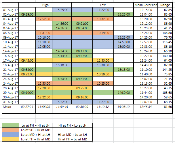
You can create a simple excel sheet to capture the following details, Time stamp for - High, Low, and Mean Reversion of the day. I have categorized time as 1st hour (FH)/last hour (LH) and Mid Day (MD). You will see a pattern here, and over time you may be able to internalize this pattern.

 As an Intraday trader I am direction agnostic here, and as you can see there are only 4 types of days. And yes for the best part, look at the Mean Reversion column, it speaks for itself.

xl.PNG

Combining this with NIFTY Range probabilities should help you improve your ability to make short term forecasts of market direction.